 |
| After: Decor and concealed storage |
 |
| After: Additional views |
 |
| Additional views |
 |
| After: Additional view |
 |
| After: Concealed storage additional view |
 |
| Before: Open shelving no decor |
 |
| Progress: Decor going up |
 |
| Before |
 |
| After: Finished break room with faux window |
 |
| After: Additional view |
 |
| After: Closeup of decor |
 |
| After: Opposite wall from above picture |
 |
| After: Additional wall with message center |
 |
| After: Additional view |
 |
| Progress: First table that was returned |
 |
| Progress: Moved 1st table in with decor for room |
So I am approaching this post slightly different. Can you tell the change? Yes, I am reversing the order of the pictures. Instead of giving the bland before photos as the first photos you see, I decided to give you the finished product and work in reverse order. I think it makes for a more sightly initial post. What do you think? I welcome your comments and feedback for the site.
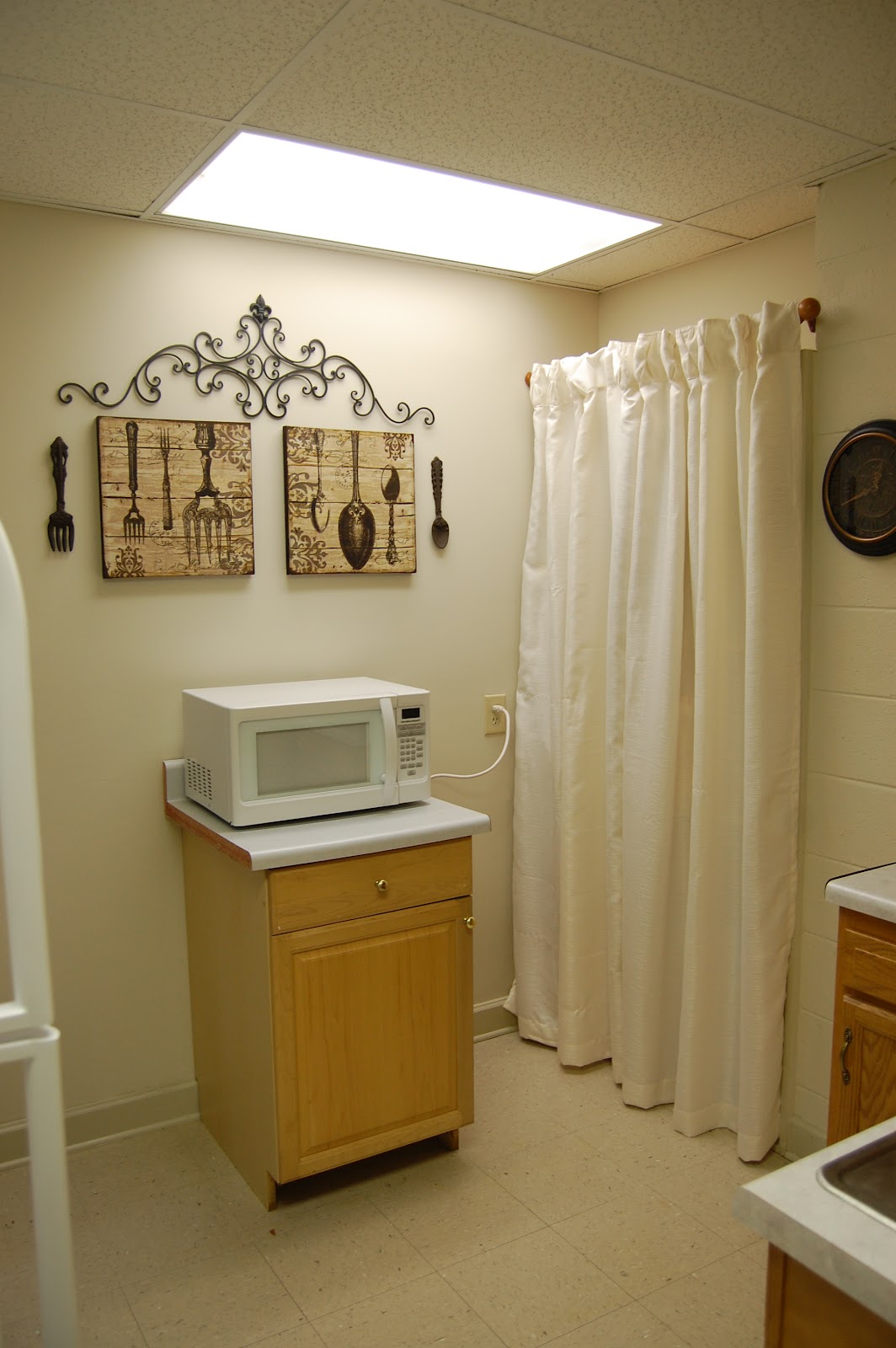
Let us start with the kitchenette. (Again, the entire office is painted in a flat very neutral cream color with florescent lighting throughout, neither of which was my choice but the building owner's decision). With this color palate and lighting it makes for a very drab backdrop. Incorporating color without paint can present many difficult challenges at times. As you can see in the kitchenette area we had open shelving with products cluttering the shelves. By incorporating the fork and spoon pictures and the coordinating iron silverware and scroll above the pictures it really makes the area alive with color. Yes, it also brings the cabinet color around to warm the room up even though the pictures are still in a neutral palate. It is all about drawing your eyes around the room without pointing out a particular subject. Did you know that green is considered neutral? It sure is. By adding a the tiered vases with pops of green vase filler and candles not only does the area brighten, but the candles smell fabulous. Adding the raphia to the outside of the vases incorporates added dimension and texture. What do you think about the shelving area, do you remember it? Why did I choose a curtain the same color as the wall? Consider this: If a darker color curtain or even a curtain the color of the cabinetry would have been placed, it would have completely changed the dynamics of the room. It would have made it closed in and off balance and I had to keep in mind a a full sized refrigerator was to be installed within days. It would have also drawn your attention directly to the area. By adding the same color curtain as the wall color it gives the room balance and an open feeling. I neglected to get a full view picture of the kitchenette with the refrigerator installed, but you can see the handles in some. The end result was a clutter-free larger kitchenette feeling. Very clean and crisp.
Now across the hall we tackled the break room. Again, we were in a time crunch to get the decor installed in the 2000 sq (or more at this point I cannot remember) office so I failed to get TRUE before pictures. You will, however, see the the addition of the table to the break room area. That table was purchased on clearance at a local discount store on a huge markdown. It was nice to have the concealed leaf storage to the table, but it was heavily damaged and a little rickety. While running through Wal-Mart one day to pick up nails and such to hang photos in the office with I happened by the furniture section. I looked over and saw this table and thought...that is it. The chairs and bench seating were sold separately, however, it gave me the option to mix and match the seating and add an additional color to the room. Believe this or not, the table was/is a nicer table than the damaged table and it was $40.00 cheaper! YES. The table, chairs, and bench seating were all purchased for around $200.00 give or take. Again, with the bland wall color and florescent lighting the room was very dark. So to give a play on the eye, we installed a mirror that has a very similar appearance to a window. We went with the French Bistro theme in there for a little fun and addition of color. Adding cafe' curtains to the sides of the mirror once again deceives the eye while introducing more light with DARK colors. We were on a budget which prevented me from actually adding a black shelf to below the mirror. Yes a black shelf would have really looked nice below the mirror and continued on with the deception of a real window. The small space now appears much larger and is a nice area to have to eat your lunch or a quick snack.
How do you feel about both spaces? Small changes in subtle ways have LARGE impact on small rooms. Can this be incorporated into your home or office? What was your favorite part of this installment?
I very much appreciate you stopping by and hope you thoroughly enjoyed the post. Until next time, may you enjoy the first signs of fall and breathe in the wonderful creation God has made. ~Lisa
~L M Cline's LLC
"Plant your roots in Christ and let HIM be the foundation for your life. Be strong in your faith, just as you were taught. And be grateful." Colossians 2:7


No comments:
Post a Comment