Glorify

...as it is written, "He who glories, let him glory in the LORD." 1 Corinthians 1:31

Wednesday, July 25, 2012

Textured Living Room


Before living room


Before Additional view of the living room


Progress:  Knockdown added to the walls


Progress:  Knockdown this is the couch wall


Progress:  Walls and ceiling now painted (notice the dark wood colored cap to the wall)

Progress:  Mess is cleaned up ready for furniture

Progress:  Couch wall 


After:  Newly painted cabinetry with new hardware and decorated
Before the iron work was added

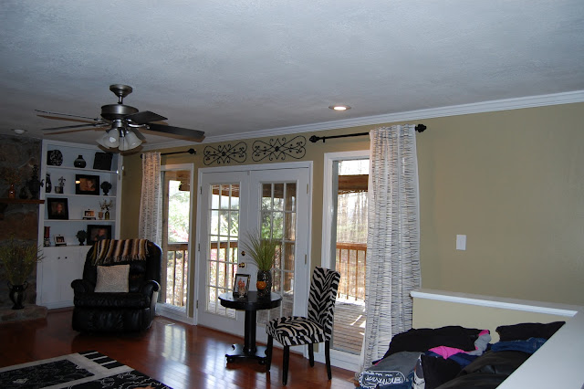
After:  Decor and furniture are in

After:  iron work added above the doors 

After:  Additional view of the fireplace

After Couch wall  (client now has additional ironwork on both sides of the mirror

lmclines@comcast.net


Isn't this room very warm and inviting?  Before this remodel took place, the client had a furniture layout already in mind.  Furniture was from a previous home as well as the majority of the decor and curtains.  Again, she has used a different color of green in this room to coordinate with the rest of the home.  

Let us begin with the remodel process in this room.  Again, the homeowners were very instrumental in the work that took place in this home.  All ceilings were scrapped of the old "popcorn" ceiling technique (which the client's husband did all of the removal) and updated with the California knockdown treatment not only to the ceiling, but to the walls as well.  This technique is wonderful to protect your walls from the damage of everyday living and also adds another dimension to the room in your layering.   After the walls received the knockdown treatment, again we primed with Valspar primer.  The ceilings were them painted with standard contractor white.  They walls were then painted with Benjamin Moore #515 Baby Turtle in an eggshell finish.  This is a wonderful paint.  At certain times of the day it takes on a more khaki color and other times of the day it appears to be more green.  Absolutely stunning color of paint.  The crown, base, and built-in cabinetry received a healthy dose of semi-gloss trim paint.  We also painted the small wall on the left side of the hearth semi-gloss white for illusion purposes.  When the budget allows a small table and shelving will be introduced to trick the eye into thinking there are built-ins on both side of the fireplace.  But for now a few pictures adorn the walls.  The addition of can lighting came into play here.  By adding the additional lighting we brightened this room considerably.  (Again, the client's husband is a licensed electrician and we were able to save a lot of money here by him doing all the electrical work).  The white ceiling fan was exchanged for a newer sleek modern black fan with satin finishes.  Subtle changes lead to a huge impact on design in the room.  

Again, the client had the majority of the decor and curtains from a previous home and knew pretty much were things were going to be placed.  L M Cline's was there to put things in the places the client desired  We introduced ironwork above both doors out to the fabulous covered & screened in deck.  (This is such a warm welcoming serene place to be.)  Can you believe what a simple ironwork can to do bring your doors to a new level?  Charming.   

We also transformed the stairwell half wall from brown trim on top to white to make the room more cohesive and flow. Before the brown wood stood out, but now it blends and flows with the rest of the room.  

Thank you for stopping by and viewing one of our projects.  I hope you enjoyed the transformation of this room and look forward to the entryway and hall in our next post.  You will be able to see how well the home flows from one room to the other with color and also how the introduction of a few key pieces of furniture or decor can completely transform the feeling of a room.  

Until the next post...Lisa M. Cline

"Whenever you stand praying, forgive, if you have anything against anyone; so that your Father also who is in heaven may forgive you your transgressions."  Mark 11:25-26


Saturday, July 7, 2012

Modern Dinning Room with DIY semi-custom Curtains

Before:  Chair rail and popcorn ceiling.  Brown chandelier 
Progress:  Ceiling scrapped and walls received knockdown treatment


Progress:  Plastic removed
After:  newly painted walls, ceiling, and updated chandelier
After:  Stock curtains receive special treatment
After:  Closeup of walls and curtains
After:  Decor going up and changing the tablescape, slightly

After:  Chandelier moved to center of room, spray painted, and added new shades

After:  Updated tablescape


After:  Beautiful lighting 

After:  Additional view


So, what do you think?  This home received a huge face lift called TEXTURE.  When the home was purchased and it was decided to put knockdown on the walls, the home owner was really drawn to the colors that were previously on the walls.  Therefore, you may not think the color scheme changed, however, it did.  This home flows from room to room with the colors of greens.  Remember the kitchen...in the very last photo of this post, the kitchen is just to your right.  The colors may seem similar, and they are.  

This dinning room received a complete face lift as far as texture goes.  Again, the homeowner and her husband were very involved with L M Cline's and this remodel.  The clients removed the old popcorn ceiling and helped prepare the room for the California Knockdown treatment.  The chandelier was moved slightly in the room to be centered between the windows and above the dinning room table.  As you can see it was a rather quick process for this room in particular.  After taping and putting plastic up the treatment was installed.  The room was then primed with Valspar primer, both ceiling and walls.  Then Benjamin Moore adorns the walls with #493 Harbour Town in an eggshell finish above the chair rail and below #494 Lewiville green graces the bottom half also in an eggshell finish.  Standard white contractor Valspar ceiling paint was used to paint the ceiling in a flat finish.  The crown molding, chair railing, cased openings, window trim, and baseboard were not above a new coat of semi gloss paint to achieve the fresh new crisp look.  A new chandelier was not in the budget.  Updates and facelifts are not just for the walls...we gave the chandelier an updated modern, but elegant look as well.  It is amazing what spray paint can do.  I failed to get a closeup of the chandelier before the updated look, but the finished product says it all.  A few coats of black spray paint and new shades now elegantly hangs in the dinning room for all to enjoy.  

Again, this client was very instrumental in her placement of previous decor from another home.  As you can see she really likes the greens and blacks with a splash of orange for a pop of color.  The beautiful Damask black and white curtains were purchased from Target.  The curtains were not available in a 95" length which would have been preferred for height in this room.  However, the client had strong feelings for these curtains and purchased the last 4 available in Knoxville, Tennessee in the 84" length.  However, once installed a problem presented itself... two were 84" in length and two were 82" in length.  (Most of you all would not consider this a stroke of luck, but I certainly did!)  Since no more curtains were available, and the client really wanted them...we just had to make them work!  Solution...the introduction of a hot glue gun and fringe from Hobby Lobby.  A simple but elegant fix that now gives this client semi-custom drapes.

As you can see you get a sneak peak at the living room which will be our next post.  Again, hard work goes a LONG way.  It is not that hard to give a home and updated look with character and spirit with paint, furniture, and accessories in the correct places.    

I hope you enjoyed this post and until next time... seek to make the things around you beautiful one room at a time. 
 Lisa M. Cline

"What is faith?  It is the confident assurance that what we hope for is going to happen.  It is the evidence of things we cannot yet see."  Hebrews 11:1


Sunday, July 1, 2012

Updated and Modern Kitchen remodel

The 80's tile counter and backsplash

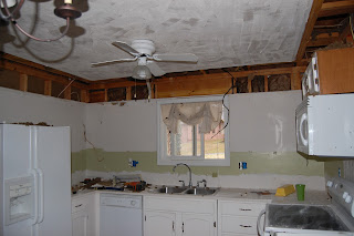
Before Kitchen


Progress:  Backsplash gone

Progress: Ceilings scrapped and cornice removed

Progress:  Entire view


Progress:  Wrapped cabinets awaiting knockdown treatment

Progress:  Wiring moved, can lights installed

Progress:  Better view of kitchen
Progress: Painting cabinets

Progress:  Stock 80s cabinetry being updated with paint


Progress:  Knockdown treatment and finished cabinetry installed.  Awaiting new microwave

After:  New countertops, cabinetry installed, and new microwave


After:  Small eating area

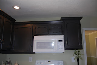
After:  New elevation to cabinetry with crown molding
After:  New elevations to cabinetry and crown molding


Finished:  Homeowner added her decor to the kitchen