 |
| The 80's tile counter and backsplash |
 |
| Before Kitchen |
 |
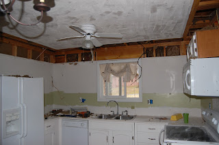
| Progress: Backsplash gone |
 |
| Progress: Ceilings scrapped and cornice removed |
 |
| Progress: Entire view |
 |
| Progress: Wrapped cabinets awaiting knockdown treatment |
 |
| Progress: Wiring moved, can lights installed |
 |
| Progress: Better view of kitchen |
 |
| Progress: Painting cabinets |
 |
| Progress: Stock 80s cabinetry being updated with paint |
 |
| Progress: Knockdown treatment and finished cabinetry installed. Awaiting new microwave |
 |
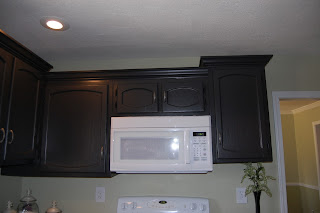
| After: New countertops, cabinetry installed, and new microwave |
 |
| After: Small eating area |
 |
| After: New elevation to cabinetry with crown molding |
 |
| After: New elevations to cabinetry and crown molding |
 |
Finished: Homeowner added her decor to the kitchen
|
CAN you BELIEVE the difference? If you had not seen the before pictures, would you think this was the same cabinets? The same kitchen? Yes these are the 80s laminate pressed board cabinets. What paint, crown molding, elevations, and a lot of HARD work can do to make a more modern kitchen. This is a very budget friendly remodel. So...let us begin our journey.
The client is very fond of greens and blacks. Matter of fact, the entire home is done in this color scheme with the exception of the master bedroom and the children rooms. The client had her own decor from a previous home so a lot of money was saved by repurposing the decor in the new home.
First let me say this was a collaborated effort with the client and L M Cline's. Both her and husband were very involved in this remodel and very hands on. Her husband is a licensed electrician which allowed us to save a great deal of money being able to move the electrical ourselves. By removing the cornice were were able to elevate a few cabinets in the kitchen to give it a high-end custom look. After uninstalling the upper cabinetry we relocated the electrical and repaired the sheetrock. The entire kitchen was prepared for the knockdown treatment including the ceiling. (Before we started the remodel, the client's husband removed the popcorn ceiling to bring the home into the modern era with the California knockdown treatment.) While the kitchen is being deconstructed and reconstructed, the kitchen cabinetry is being prepared for paint. Preparing the cabinetry involved sanding, filling in holes and nicks, and cleaning. Sanding and preparing the cabinetry was the most time consuming of the kitchen remodel. The cabinets were painted with the newest thing on the market for cabinetry and wood painted furniture and you know who makes it.... RIGHT again!!! Benjamin Moore! I really like the look and feel of this paint. Everything about it looks and feels like latex right down to the the durability of an based paint, but it is latex.
ADVANCE® Waterborne Interior Alkyd Paint
ADVANCE offers the application and performance of traditional oil paint in a waterborne formula that cleans up with soap and water. It is a 100% alkyd formula water-dispersible alkyd developed with proprietary new resins that keep VOCs low even after tinting. It flows and levels like a traditional alkyd with the extended open-time required to achieve high-end finishes. ADVANCE is available in unlimited colors, giving you more ways than ever to achieve the perfect look on every job.
This paint is every bit of what it says it is and MOORE (could not resist that). You know how I feel about Benjamin Moore, but this... this is unbelievable.
Now back to the remodel... After preparing and installing the knockdown treatment everything received a very liberal dose of primer. On new construction we use the cheapest form of primer and for this client it happened to be Valspar primer. After the primer was dry and the cabinets getting their facelift with Advance paint, the kitchen was painted with Benjamin Moore Harbour Town #493 in an eggshell finish. At first the client was not very keen on this color, but with the black cabinetry it really made the kitchen appear more open and bright. All the while really complimenting the cabinetry. After the paint on the cabinets were dry they were reinstalled and crown molding added. (In the future lightbar will be added to the bottom of the cabinetry to give it a more high-end look as well, but the budget would not allow for this currently.) The new countertops were installed. We were able to reuse the original sink and facet saving the homeowner more money. A new microwave oven was purchased and installed as well. Once the entire home remodel was finished the clients were able to move in and start with the decor.
Again, the majority of the decor was repurposed from the home they moved from. This client knows exactly what she wants and works very hard to achieve her desired look. Everything worked nicely and complimented the work done very well. As it is said, a picture is worth a thousand words...what do you think? A very nice upgrade on a tight budget. If you are willing to put in the time, effort, and hard work there is nothing that you cannot achieve.
I hope you enjoyed this post. Next we will move into the dinning room where I will show you very cost effective ways to update outdated or unsightly chandeliers and take ordinary Target curtains into fully custom window treatments with the use of fringe and a hot glue gun.
Until the next post.... Lisa M. Cline
"Whatever you do or say, let it be as a representative of the Lord Jesus, all the while giving thanks through Him to God the Father." Colossians 3:17
The client was very pleased with the end result.


No comments:
Post a Comment