 |
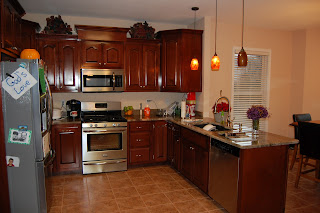
| Before View of the kitchen |
 |
| Additional view from the dinning room |
 |
| Additional view from the living room |
 |
| After a neutralizing the wall color to make the space more cohesive and flow |
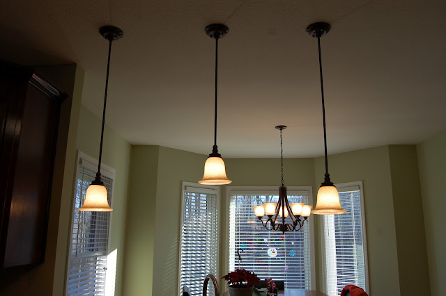 |
| Changed the lighting over the sink |
 |
| Finished product. Glass tile back-splash added to make the space more cohesive |
 |
| Purchased a buffet with additional seating for the kitchen area. Also purchased many decorative pieces for the space. |
 |
| Stock valances. L M Cline's added trim to the curtains after purchasing for a more custom look. Added additional artwork to the walls. |
 |
| Added placemats, fabric napkins, and napkin rings along with a custom centerpiece any homeowner would adore. |

 |
| A close-up of the glass tile. Purchased tile really pulled the granite counter tops, cabinetry, & floor tile together for a very glamorous space in the kitchen. |
L M Cline's was hired to make this room more cohesive and flow with the rest of the home. The client had already purchased a beautiful picture for the room and wall sconces, however, the room lacked unity. It was the desire of the client to have a beautiful high-end look in which they can enjoy eating family meals. It was determined during our first consultation that additional cabinet space and seating would need to be incorporated into the design. The end result should reflect an open air feel allowing the light to show case the kitchen itself. From this space you can see the main hallway to the back bedrooms, the office, the living room, the dinning room, and foyer. The first task at hand was to achieve a harmonious balance within the room. The granite color is composed of greens, tans, and browns with the green being the predominant color. The cabinetry is mahogany with a high gloss finish. The tile floor is a terracotta color. The walls were a peach/tan color in flat paint.
As you can see we neutralized the wall color with a beautiful green color in an eggshell finish (#493 Harbor Town by Benjamin Moore, in the classic color section). We then changed out the above sink lighting to achieve better lighting and more cohesiveness in the area. The tile back-splash was then added (Pietra Art Bliss NS351RSP5/8 Cappucinno by Florida tile with grout 940, antique white) purchased at Lindsay's Carpet in La Follette, Tn. After this addition the kitchen had taken on an entirely different look. Crown molding was then added to the wall/ceiling area and painted out. L M Cline's picked out curtain valances that had a very classic look, but needed additional flare. We added trim to the bottom of the valance and instantly a totally custom look was achieved at a fraction of the price. Accessories were purchased for the entire space to bring it together for a very classic look. Additional features to the room were below and above cabinetry lighting added along with light bar additions to the bottom of the cabinetry for finishing touches that really brings the space to a higher level of beauty.
I think you will agree that before the client's artwork seemed to fade away into the wall and be over-looked. After L M Cline's finished with the space it was harmonious and beautiful with the architecture features of the room being show cased. They artwork now stands out and is beautifully complimented with the buffet, chairs, and accessories.


